플러터 BMI 앱 만들기
· 8 min read

📚 오늘의 학습 내용
BMI앱을 만들어 보면서 테마 설정 부분을 배울 수 있었다. 라이트 테마, 다크 테마를 통해서 전체적인 색상을 변경할 수 있었고 또 시스템 옵션을 선택하는 것을 통해서 휴대폰의 설정에 맞게 테마를 정할 수도 있었다.
그리고 네비게이터를 활용해서 화면 이동에 대해서 배울 수 있었다. 스택 구조로 위의 화면이 쌓이는 구조고 거기서 한 칸씩 뒤로 나오는 구조였다. 새로운 위젯들도 많이 나왔는데 확실히 처음부터 내가 만들어 봐야 내 것으로 만들 수 있을 것 같다.
✍️ 주요 학습 내용
배운 내용
- 테마 설정
- 네비게이터
새로 알게된 개념
프로젝트 폴더 관리
lib안에pages폴더를 넣고 그 안에 페이지 별로 폴더를 만들고 그 안에widgets폴더를 만들고 그 페이지에서 사용되는 위젯들을 넣음
- lib
	- pages
		- home
			- home_page.dart
			- widgets // HomePage 내에서 사용할 위젯들
		- result
			- result_page.dart
			- widgets // ResultPage 내에서 사용할 위젯들
	- widgets // 앱 내에서 전체적으로 함께 사용되는 위젯들. 이번 프로젝트에서는 쓸일이 없음.
새로운 위젯
-
Slider
Slider(
	// 값 - 여기서는 테마 확인을 위해 고정값을 넣었지만
	// 사용할 때에는 변수를 넣고 onChanged에서 해당 변수의 값을 바꿔주고
	// setState 호출해서 사용
  value: 1,
  onChanged: (v) {},
  min: 1, // 최소값
  max: 300, // 최대값
) -
CircularProgressIndicator
import 'dart:math';

import 'package:flutter/material.dart';

class ResultGauge extends StatelessWidget {
  const ResultGauge(this.result);
  final double result;
  @override
  Widget build(BuildContext context) {
    return Stack(
      alignment: Alignment.center,
      children: [
        // 가로 세로가 같은 SizedBox를 사용할 때
        SizedBox.square(
          dimension: 250,
          child: CircularProgressIndicator(
            value: 1,
            strokeWidth: 2,
            color: Theme.of(context).dividerColor,
          ),
        ),
        SizedBox.square(
          dimension: 250,
          child: CircularProgressIndicator(
            value: min((result / 35), 1), // BMI max 35!
            strokeWidth: 3,
            color: Theme.of(context).highlightColor,
          ),
        ),
        // Stack 의 크기가 자녀위젯의 크기에 따라 달라지므로 Center 사용 불가
        Text(
          result.toStringAsFixed(1),
          style: TextStyle(fontSize: 20),
        ),
      ],
    );
  }
} -
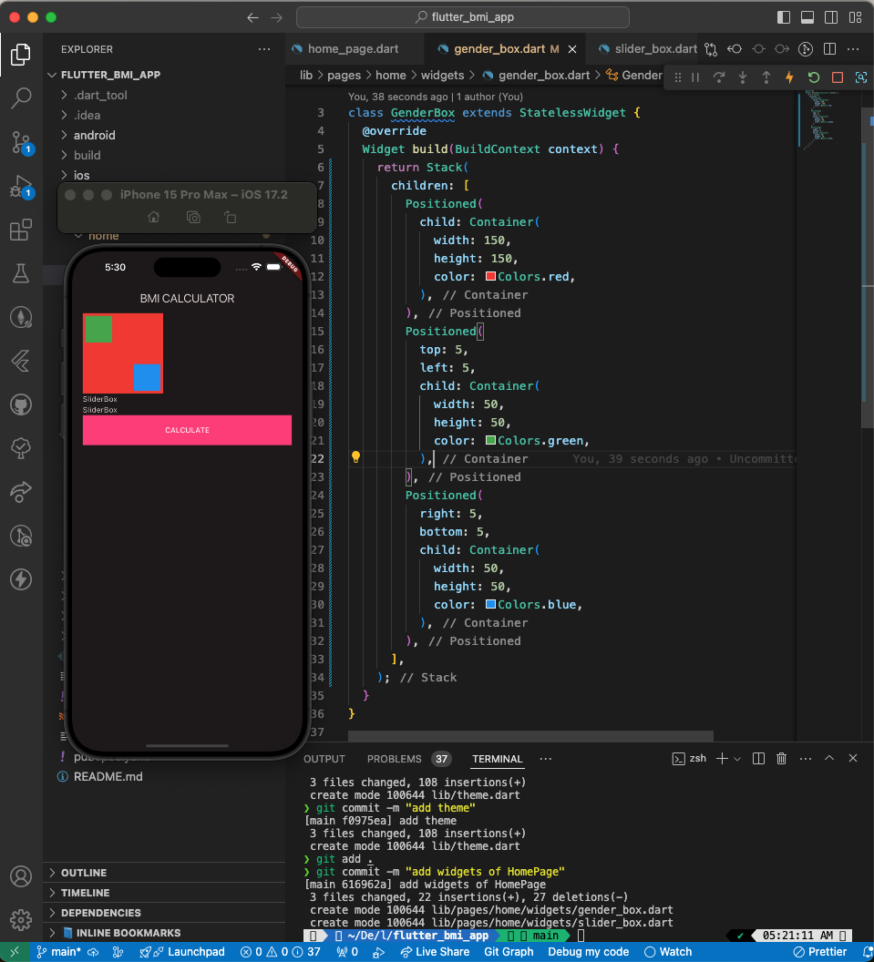
Stack (여러 자식 위젯들을 겹칠 때 사용)
- 겹치는 거라면서요? GenderBox안의 Container는 안겹치는데요?
- Stack 내에는 Positioned라는 위젯을 사용 가능
- Positioned 위젯이란?
- left, top, right, bottom 속성을 이용해 Stack에 위젯을 자유롭게 배치할 때 사용
- 사용방법
Stack(
    children: [
      Positioned(
        child: Container(
          width: 150,
          height: 150,
          color: Colors.red,
        ),
      ),
      Positioned(
        top: 5,
        left: 5,
        child: Container(
          width: 50,
          height: 50,
          color: Colors.green,
        ),
      ),
      Positioned(
        right: 5,
        bottom: 5,
        child: Container(
          width: 50,
          height: 50,
          color: Colors.blue,
        ),
      ),
    ],
  )
- Positioned 위젯이란?
- Stack 내에는 Positioned라는 위젯을 사용 가능
- 주의할 점
- Stack을 감싸고 있는 부모위젯의 크기가 없을때에는 자식위젯의 가장 큰 위젯을 기준으로 크기가 결정
- 부모위젯의 크기가 있을 경우 부모위젯의 크기를 기준으로 크기를 결정합니다.
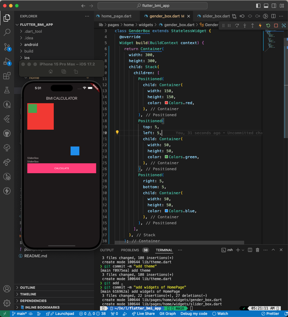
- 겹치는 거라면서요? GenderBox안의 Container는 안겹치는데요?
테마 적용
공식문서
Use themes to share colors and font styles
-
MaterialApp 의 theme, darkTheme 속성에 ThemeData 클래스를 정의해서 사용
-
lib/theme.dart파일 생성 후 분리 -
예시
import 'package:flutter/material.dart';

final lightTheme = ThemeData(
  useMaterial3: true,
  colorScheme: ColorScheme.fromSeed(
    seedColor: Colors.pinkAccent,
    brightness: Brightness.light,
  ),
  highlightColor: Colors.pinkAccent,
  dividerColor: Colors.black38, // black opacity 38%
  sliderTheme: SliderThemeData(
    activeTrackColor: Colors.black38,
    inactiveTrackColor: Colors.black38,
    trackHeight: 1,
    thumbColor: Colors.pinkAccent,
  ),
  elevatedButtonTheme: ElevatedButtonThemeData(
    style: ButtonStyle(
      shape: MaterialStatePropertyAll(RoundedRectangleBorder()),
      backgroundColor: MaterialStatePropertyAll(Colors.pinkAccent),
      foregroundColor: MaterialStatePropertyAll(Colors.white),
    ),
  ),
  outlinedButtonTheme: OutlinedButtonThemeData(
    style: ButtonStyle(
      shape: MaterialStatePropertyAll(RoundedRectangleBorder()),
      side: MaterialStatePropertyAll(BorderSide(color: Colors.black38)),
      foregroundColor: MaterialStatePropertyAll(Colors.black),
    ),
  ),
);

final darkTheme = ThemeData(
  useMaterial3: true,
  colorScheme: ColorScheme.fromSeed(
    seedColor: Colors.pinkAccent,
    brightness: Brightness.dark,
  ),
  highlightColor: Colors.pinkAccent,
  dividerColor: Colors.white30, // white opacity 30%
  sliderTheme: SliderThemeData(
    activeTrackColor: Colors.white30, // 현재값 기준 왼쪽 색상
    inactiveTrackColor: Colors.white30, // 현재값 기준 오른쪽 색상
    trackHeight: 1, // 막대기 높이(두께)
    thumbColor: Colors.pinkAccent, // 동그라미 (현재값)
  ),
  elevatedButtonTheme: ElevatedButtonThemeData(
    style: ButtonStyle(
      shape: MaterialStatePropertyAll(RoundedRectangleBorder()),
      backgroundColor: MaterialStatePropertyAll(Colors.pinkAccent), // 배경색
      // 전경색 (Text 등 child 위젯의 색상)
      foregroundColor: MaterialStatePropertyAll(Colors.white),
    ),
  ),
  outlinedButtonTheme: OutlinedButtonThemeData(
    style: ButtonStyle(
      shape: MaterialStatePropertyAll(RoundedRectangleBorder()),
      side: MaterialStatePropertyAll(BorderSide(color: Colors.white30)),
      foregroundColor: MaterialStatePropertyAll(Colors.white),
    ),
  ),
); -
ThemeData 정의
ThemeData(
    useMaterial3: true, // Material3 디자인 사용여부 2와의 차이는 아래 그림 참조
     // ColorScheme 클래스의 fromSeed 생성자를 사용하면
     // seedColor 를 기준으로 각각 요소들의 색상을 정해줍니다.
    colorScheme: ColorScheme.fromSeed(
      seedColor: Colors.purple,
      // dark, light 에 따라 디자인이 배경 색상 등이 다크모드, 라이트모드로 달라집니다
      brightness: Brightness.dark,
    ),
    // 앱 내에서 사용할 TextTheme 를 정할수도 있는데
    // displayLarge, titleLarge 등의 속성별로 정의할 수 있습니다.
    textTheme: TextTheme(
      displayLarge: const TextStyle(
        fontSize: 72,
        fontWeight: FontWeight.bold,
      ),
      // ···
      titleLarge: GoogleFonts.oswald(
        fontSize: 30,
        fontStyle: FontStyle.italic,
      ),
      bodyMedium: GoogleFonts.merriweather(),
      displaySmall: GoogleFonts.pacifico(),
    ),
), -
예시
Widget build(BuildContext context) {
    return MaterialApp(
	    themeMode : ThemeMode.dark,
      theme: ThemeData(
        useMaterial3: true,
        highlightColor: Colors.pinkAccent,
        colorScheme: ColorScheme.fromSeed(
          seedColor: Colors.pinkAccent,
          brightness: Brightness.light,
        ),
        dividerColor: Colors.black38, // black opacity 38%
        sliderTheme: SliderThemeData(
          activeTrackColor: Colors.black38,
          inactiveTrackColor: Colors.black38,
          trackHeight: 1,
          thumbColor: Colors.pinkAccent,
        ),
        elevatedButtonTheme: ElevatedButtonThemeData(
				  style: ButtonStyle(
					  // 꼭지점 둥글게
					  shape: WidgetStateProperty(RoundedRectangleBorder()),
					  backgroundColor: MaterialStatePropertyAll(Colors.pinkAccent), // 배경색
            // 전경색 (Text 등 child 위젯의 색상)
            foregroundColor: MaterialStatePropertyAll(Colors.white),
				  ),
				),
				outlinedButtonTheme: OutlinedButtonThemeData(
				  style: ButtonStyle(
					  shape: WidgetStateProperty(RoundedRectangleBorder()),
					  side: MaterialStatePropertyAll(BorderSide(color: Colors.black38)),
            foregroundColor: MaterialStatePropertyAll(Colors.black),
				  )
				),
      ),
      darkTheme: ThemeData(
        useMaterial3: true,
        colorScheme: ColorScheme.fromSeed(
          seedColor: Colors.pinkAccent,
          brightness: Brightness.dark,
        ),
      ),
      home: HomePage(),
    );
} -
내부 Container의 가장자리 선 색상을 Theme을 통해서 정할 수 없음 → theme에 색상을 넣어주고 그 색상을 Container에서 사용 가능
- Theme에 색상 추가(dividerColor)
theme: ThemeData(
    useMaterial3: true,
    colorScheme: ColorScheme.fromSeed(
      seedColor: Colors.pinkAccent,
      brightness: Brightness.light,
    ),
    dividerColor: Colors.black38, // black opacity 38%
  ),
- Container에서 Theme Color 가져오기
→ Theme.of(context).[색상명]
Container(
  width: 80,
  height: 80,
  decoration: BoxDecoration(
    border: Border.all(
      color: Theme.of(context).dividerColor,
    ),
  ),
),
개발 꿀팁
→ 넘기는 변수가 3개 이상일 때는 named parameter 로 하면 클래스 생성시 이름이 나옴
→ toStringAsFixed(0) 소수점 몇 번째 자리까지 나오게 할지 정하는 것
실습한 내용
- BMI 앱 만들기
🚨 발생한 문제/에러
- 없었음
📝 코드 스니펫
// 오늘 배운 주요 코드
HomePage({
	required this.label,
	required this. value,
	required this.unit}
);
📚 내일 학습할 내용
- 개인 과제
💭 오늘의 회고
잘한 점 👍
- 강의 집중함
개선할 점 🔨
- 중간에 졸아버림
배운 점 💡
- 테마 설정
✏️ 참고 자료
- Flutter 공식 문서: https://docs.flutter.dev